Taking photos in iOS has always been a relatively simple affair, just by using the Camera app by Apple. But third-party developers have gone further to make the iPhone camera work harder for you and the photos you take every day.
This is what Obscura has been doing since its launch in 2015. Developed by the Obscura team of Ben Rice McCarthy, Adam K. Schmidt and Sara Lovic, the third version of the app launched this week (February 17) for $9.99 / £9.99 / AU$10.99.
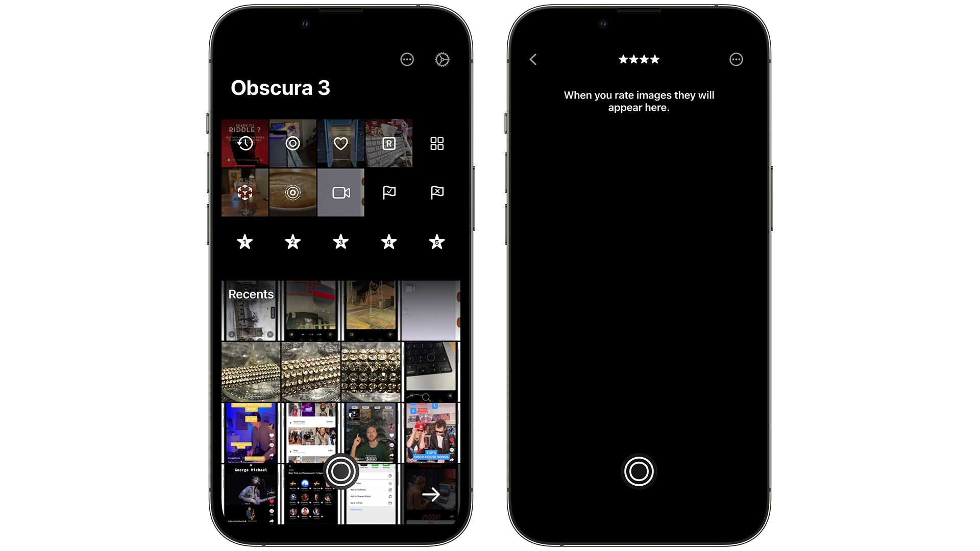
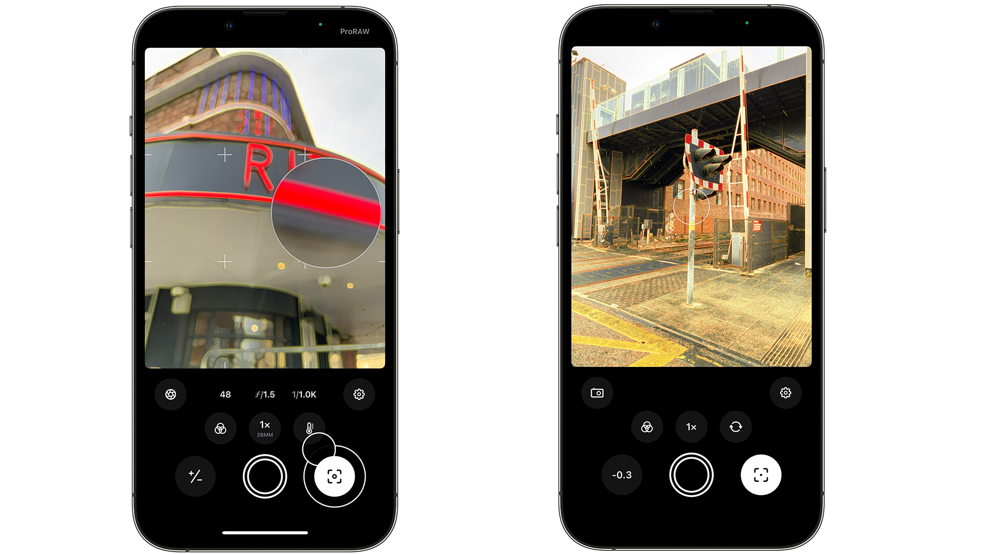
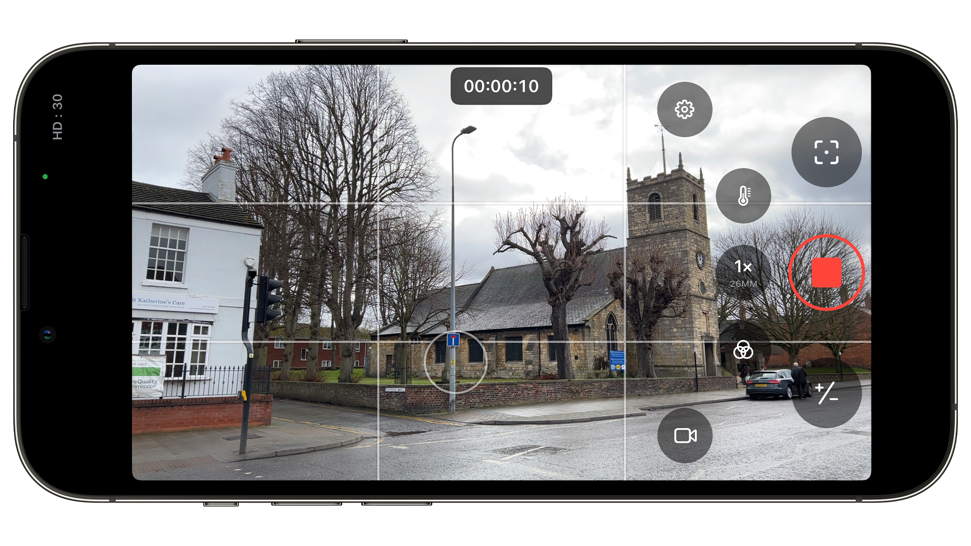
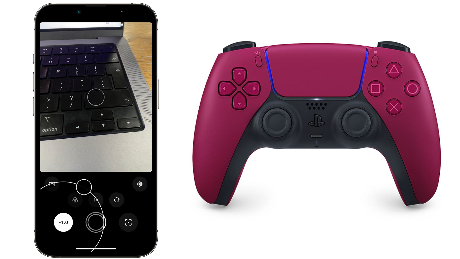
This new version brings a redesigned gallery view, video capture, refined layouts for controlling exposure settings, and the multiple lenses of the iPhone models, alongside controller support. This allows anyone with an Xbox or PlayStation controller, to take a photo through Obscura 3.
Having used the update for a month, it’s a significant improvement over Obscura 2. The new gallery view brings your albums front and center, giving you a quick overview of what you want to select.
There’s also the ability to rate your photos, not just a thumbs up or down as in Apple’s Photos app. Here, you could take a selection of photos, say different locations for a wedding venue for instance, and rate them in order. It makes sorting some photos much easier, as it could help you decide on certain locations or products for those important situations.

It’s the gestures that help make Obscura 3 shine - especially the exposure gesture. As you’re taking a photo, you can press the exposure icon on the bottom-left of the app to change how light or dark you need the image to be. But if you use your thumb to slide up and down on the icon, you can more accurately choose the exposure point instead.
These little touches are found across the app in this third version. While you can’t currently change the default camera app in iOS, Obscura 3 makes a compelling case for why the option should be there for pro users.
A chat with Obscura’s developer
Speaking with McCarthy after the launch of Obscura 3, I asked them whether the pandemic inspired the development of the new update, in regards to features and what users were asking for. “Not particularly. In an ideal world we would have taken a trip to somewhere exciting to take incredible marketing photos of rainforests or glaciers,” McCarthy clarifies. “But for the most part, the production of Obscura 3 wasn’t all that different to Obscura 2.”
With every major update to an app, there’s always the question of what the main objective was for the newest version. We asked McCarthy what the aim was for Obscura this time. “Am I allowed to say everything? Because we really did throw it all out and start from scratch,” McCarthy continues. “There are obvious changes like the new camera interface, but everything has been rewritten and improved, like the gesture to close the camera, the photo capture pipeline, the filters to support P3 color, I could go on all day.
“If I had to choose just one though, I’d probably say the Image Detail view,” McCarthy reveals. “There’s an astonishing amount of complexity to it. It was honestly pretty janky in Obscura 2. It now has better support for RAW files, depth data, video (for the first time!), and is much smoother at handling changes to the photo library while you’re browsing. The triage features are also really neat if you care about keeping your library organized.”

We wanted to mention the Exposure wheel, which we found very intuitive for allowing certain amounts of light in. We asked McCarthy how this came to be, and why it’s arriving in this update.
“Conceptually, the Exposure and Focus dials were planned from the very start. In fact, I had built a very rudimentary version of them in Obscura 1, but it wasn’t great,” McCarthy explains.
“We played around with the functionality quite a bit. Should the dial have values displayed around the ring? Should the sensitivity vary as it expands? How sensitive should the haptic feedback be? But everything we added made it feel less intuitive and more distracting. In the end, the simpler it was, the more natural and like using a physical camera it felt.”
With the new gallery view being a tentpole feature of Obscura 3, we asked McCarthy whether there was going to be an option for opening the app and having the gallery appear first.
“I had thought of making that an option for the forthcoming iPad version, which is well suited to browsing and editing photos, but I hadn’t really considered it for the phone,” McCarthy explains. “But if we build that functionality anyway, I don’t see why we wouldn’t add it to the phone.”

In-app purchases, or IAPs, are ways for users to buy more features for an app. In previous Obscura versions, this allowed you to buy additional filters, but for Obscura 3, there are no IAPs this time.
We asked McCarthy what the reasons for this were, and if IAPs have had their due, especially for photography apps.
“There were a few reasons behind this decision, benefitting both us and the user. The first is that we wanted to avoid the feeling of upselling, especially when the user is in the middle of taking photos,” McCarthy explains.
“Secondly, the StoreKit API has also been a pain to work with in the past and was the source of more support email than any other part of the app. And thirdly, having IAPs for filters necessitated having example photos for the product pages, and those added quite a considerable amount to Obscura’s download size (O2 was about 70MB and O3 is down to about 5MB, though the sample photos weren’t the only factor).”
The gallery view also shows promise for other Apple platforms, such as macOS, an operating system that doesn’t have an Obscura app. We wondered whether this is something up for consideration.
“I’m certainly not promising anything right now, but I have tried building it for the Mac using Catalyst and it mostly runs without issue,” McCarthy reveals. “The real work would be in making it feel more at home on macOS, so I guess we’ll have to see if we can find the time to make it happen.”

A surprising feature was the integration of controller support in Obscura 3. You could use a Dual Sense controller to take a photo if needed. We asked whether this was always intended and if there are further plans to expand this in the future.
“As I was working on the Apple Watch companion app, it occurred to me that it would be nice if there was an alternative for people who don’t have one. And I had a spare PS4 controller (in theory for playing more games on iOS, though I rarely use it) and I realized that could be a decent alternative,” McCarthy reveals.
“There’s not much functionality there right now, but we have plenty of ideas on improving this feature that just didn’t make the cut for launch.”
Finally, widgets are still being heavily used on iPhone and iPad devices, where you can place bite-sized information on your home screen without launching the app. For Obscura, this seems to be a natural step, especially for rated photos and shortcuts for launching different modes of the app.
We asked McCarthy whether this was something that they were considering. “Definitely. As soon as the launch chaos is over we’re going to start work on widgets, and we already have a few planned,” McCarthy continues. “Having access via the lock screen is a big bonus that widgets also provide. And given that we may never see an option to set third-party camera apps as the default, we have to take what opportunities we can get.”
- Our pick of the best iPhone deals in 2022 so far
from TechRadar - All the latest technology news https://ift.tt/iSQj6Af